
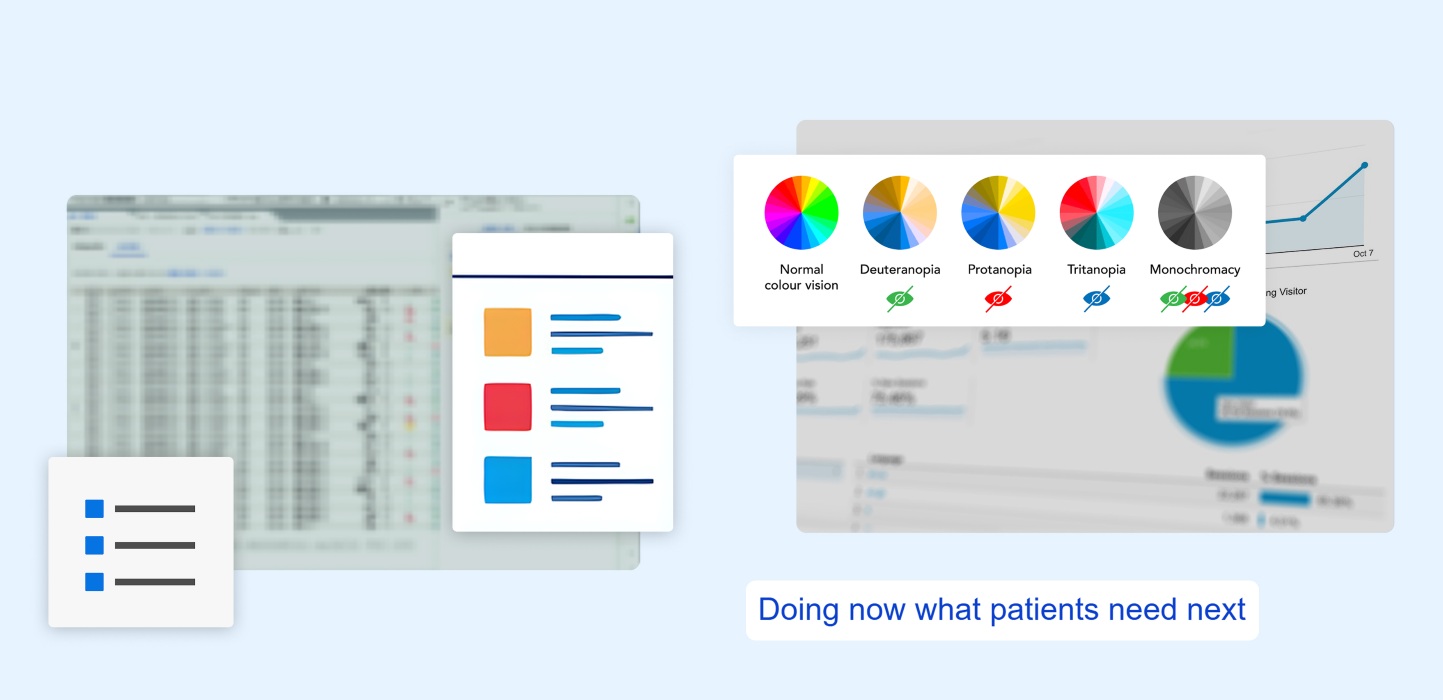
I led research and design initiatives aimed to reduce cognitive load and improve decision-making confidence in high-risk blood analysis workflows.
Accessibility-aware chart designs
considering approved color variants
Scalable widget designs
to aid in faster task execution
Role
UX Researcher: Research planning, recruitment, roadmap, user interviews, prototype testing, team alignment, framework creation and adaptation
Team Members
1 Lead UX/UI Designer, 1 UX/UI Designer; in collaboration with 1 PO, 1 BPM, 1 Developer
Company
Roche
Context & Challenges
Unclear and inefficient toolset for task completion
Healthcare professionals performing lab analysis tend to work with dense datasets, repetitive workflows, strict quality requirements, time pressure, and varying accessibility needs. When it comes to improving efficiency of workflows, the challenge is not just designing features, but helping users complete critical tasks accurately and confidently while reducing cognitive effort. Through continuous discovery research, we identified two recurring issues that I wanted to investigate further.
1. Complex interpretation of information
Users were struggling with visual clarity and quick chart interpretation with the greyscale charts in Quality Control.
2. Workflow efficiency disrupted by repetition
Users lacked streamlined tools for completing repetitive Quality Control tasks.
Initial research
Emerging themes reveal values and frustrations
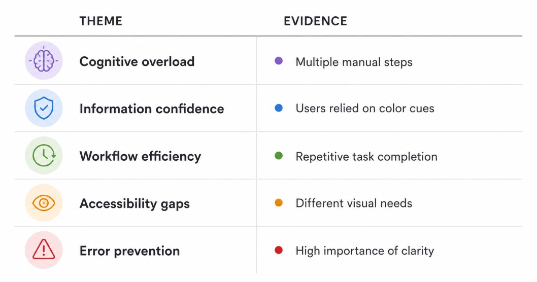
Across various sessions with users, we noticed multiple recurring topics throughout their workflows. Methods: Continuous Discovery interviews with lab technicians and lab managers, moderated usability studies, unmoderated surveys, analysis of multiple products and workflows, stakeholder conversations, and existing product feedback.
Top Insight #1
Color signals support efficiency and confidence in scanning
Many users expressed that other versions of the charts containing colors were more valuable for scanning heavy data screens and highlighting specific warnings than the current greyscale option.
Top Insight #2
Manual tasks performed repetitively slow down lab efficiency
Users expressed frustrations with some recurring tasks they had to do manually, sifting through data-heavy screens, stating that automation would greatly improve their lab efficiency.
Context deep dive
Gathering insights from the experts
After performing my own research on various types of color blindness and vision-related accessibility issues, I wanted to collaborate with experts on the matter. Filling the gaps with specialized perspectives would greatly enhance our understanding and design decisions.
Top current visual needs defined
I consulted with our product team for data on how many of our lab users worldwide reported accessibilty needs, and which types of visual needs were specified.
UX/UI-approved design directions
Working directly alongside the UX/UI Designer, we developed several chart variations that aligned with our current software while still addressing different visual needs.
Accessibility expert-supported design proposals
After learning that Roche had previous collaborations with an external group in Accessibility Expertise, I reached out to them for a meeting between our teams. They provided valuable input on our proposed designs to ensure the best outcomes for our studies.
Product Realities
Addressing product & accessibility needs
Designing equipment and software for blood analysis laboratories across the world requires specific attention to detail and unique considerations.
Accessibility requirements
Needs to support users with varying visual abilities.
Regulatory environment
Changes require careful validation.
Existing user habits
Users had developed workflows around current systems.
Technical constraints
Solutions need to fit existing product architecture.
Strategic execution
Validating solutions for both clarity & efficiency
In preparation for testing, we focused on one main anchor: improve the effectiveness of healthcare professionals working in complex lab environments through clarity, confidence, and efficiency. From there, we decided the strongest route would be to create two initiatives.
Initiative 1
Improve chart interpretation considering accessibility standards
Goal: Validate the research-supported chart designs that address diverse visual needs.
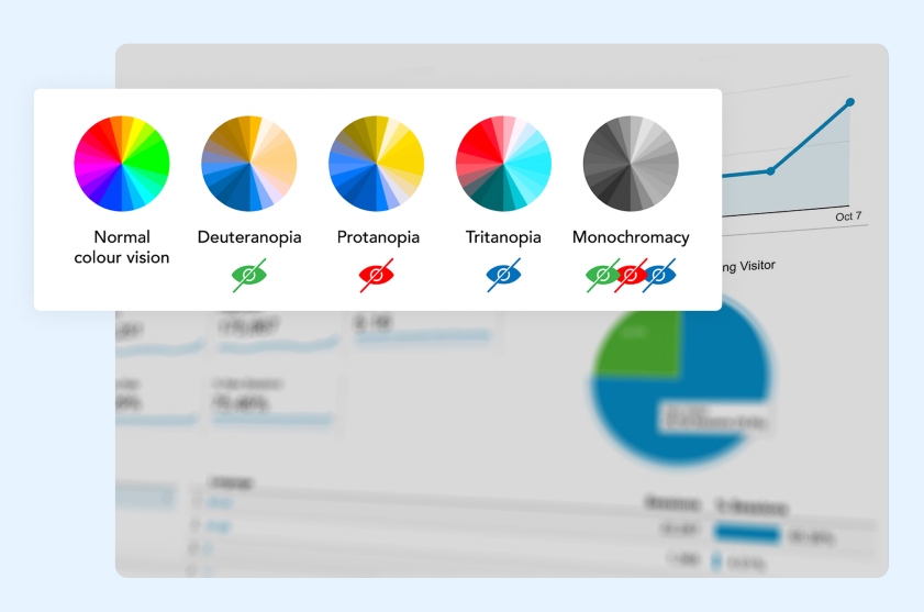
*For confidentiality reasons, full images of the initiative remain protected.
The study
Following the advice given by the accessibility experts, I recruited a participant pool of healthcare professionals with vision impairments, as well as individuals from other sectors with color blindness. I crafted two distinct surveys tailored to each group, incorporating screening questions to ensure the participants met our criteria.
I was also running formative assessment evaluations at this time, so the new initiatives had to be conducted concurrently; because of this, we carried out Initiative 1 in an unmoderated format.
The surveys were administered via UserTesting, and I carefully reviewed each user video and survey response to analyze the results.
Balancing Trade-offs
Aligning with the rest of the product team, we aimed to balance rapid discovery efforts with ongoing roadmap commitments. More specifically for this initiative, our goal was to preserve established workflows while still improving inclusivity.
Initiative 2
Reduce workflow friction of repetitive tasks with a widget
Goal: Create workflow widgets that simplify recurring lab tasks and activities.
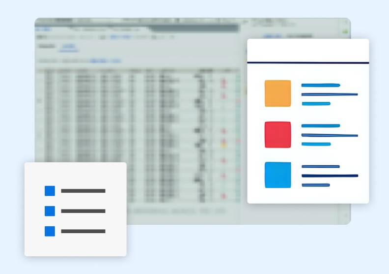
*For confidentiality reasons, full images of the initiative remain protected.
The study
The idea was to create a version tailored to Quality Control, with plans to leverage insights from this iteration for the development of future additional widgets.
Using feedback from earlier interviews and user surveys to provide context, I conducted moderated interview sessions where we introduced three different widget prototypes, observed users incorporate them into task-specific workflows, and listened for expressed values or frustrations.
Our aim was to gather valuable insights and fine-tune the design for wider use.
Balancing Trade-offs
Considering that our users made workflows around current systems, our goal in creating the widget feature was to provide meaningful efficiency gains without disrupting existing processes.
Outcome & Impact
Stronger confidence in decision-making for high-risk situations
Both studies revealed that our lab users felt more confident having clear, accessibility-aware charts and widgets for interpreting blood analysis data and making high-risk decisions.
Increased awareness of accesibility in product designs
- Validated chart recommendations through user testings
- Increased confidence among participants for reviews and decision-making
- A change in approved color palletes across the product team
- Strong support for inclusive design decisions moving forward
Widget strategy validated for workflow efficiency
- Positive user reception during validation sessions, expressing various ways in which it helps them meet daily goals
- Clear efficiency improvements via task testing
- Confirmed reduction in cognitive load
- Defined direction for future workflow enhancements
- Valuable user input regarding additional helpful features
Reflections
Efficiency comes from confidence in clear interpretations
These initiatives reinforced that improving healthcare software often requires addressing both task efficiency and information clarity. While one project focused on workflow support and the other on accessibility, both highlighted how reducing cognitive load can improve confidence, usability, and decision-making in high-stakes environments.