
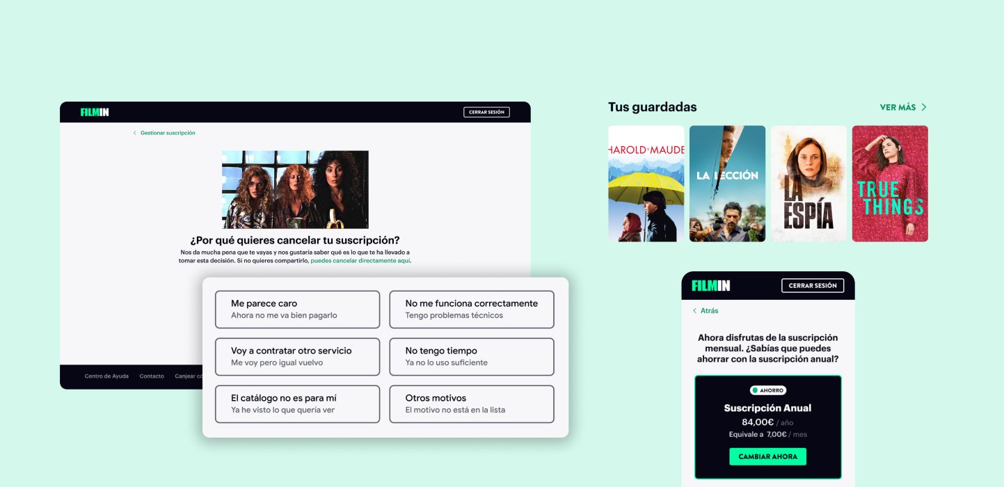
I redesigned the subscription cancellation experiences to increase insight quality and reduce preventable churn.
65%
increase in quality feedback responses
20%
decrease in customer cancellation tickets
6%
reduced churn after the new flows
Role
Product Designer: UX/UI, research, product strategy, user flows, prototypes
Team Members
1 PM, 2 Developers, 1 Growth Marketer, 1 CRM, 1 QA
Company
Filmin
Context & Challenges
Reassessing how we gather feedback
Over a six-month period, analysis showed that subscription cancellations accounted for over 60% of total churn. While the existing cancellation flow allowed users to quickly unsubscribe, it provided limited understanding of why users were leaving and offered few opportunities to address preventable churn.
1. Insufficient feedback insights
More than 70% of cancellation forms were submitted empty. How can we better understand why customers are leaving?
2. Optional feedback is not completed
How can we encourage filling out optional feedback responses while maintaining a transparent and respectful cancellation experience?
3. Generic flow isn't relevant
How can we personalize cancellation experiences and provide users a frictionless flow when sharing insights?
Research
Deciphering current insights to lead strategy
Benchmarking, competitor analysis, and heuristic evaluations helped provide insights on user flows, but we needed to utilize any insights we could from the few completed feedback forms we had.
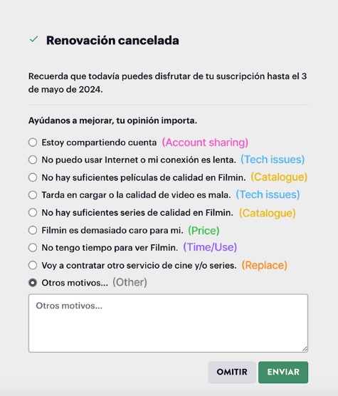
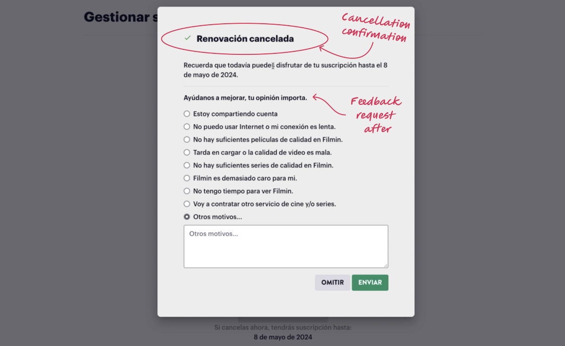
Original feedback form:
Top Insight #1
Some cancellation reasons provided little strategic value, and some were repetitive
For example, knowing whether users were cancelling a shared account did not provide us enough strategic opportunity within our business capabilities. We also had repetitive topics that could be combined.
Top Insight #2
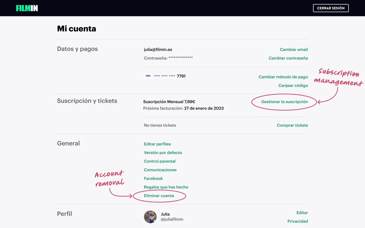
Hierarchy of subscription cancellation confuses users into account deletion
From customer service tickets we learned that users wanting to unsubscribe were accidentally following the account deletion flow because it was more visible on the page, which resulted in losing their entire account.
Product Realities
Taking all perspectives into consideration
Before forming solutions, I gathered perspectives from stakeholders and cross-functional team members to better align our path forward. These perspectives became product realities that fed into my design decisions.
Business goals
Retention has to be the focus, reducing voluntary churn is the end goal.
User needs
UX should remain transparent to preserve trust. No deceptive flows. No forced retention tactics.
Flow constraints
Find a way to add more steps without creating more friction.
Technical considerations
Solutions need to work across web and mobile web.
Product Design
Guiding a decision-making process
My goal was to reframe cancellation as a guided decision-making process that helps users find the most relevant path for their situation, while still gathering useful data on business churn.
Key Decision #1
Improve discoverability of subscription management
The subscription cancellation entry point was through the management link, so it had lower visibility within the account area than the option to delete the account itself. I wanted to guide users to their right path without disturbing their familiar flows.
Design Changes

To reduce the confusion of account vs subscription removal and help users complete their intended task, I introduced clearer guidance that redirected users toward the appropriate cancellation entry flow and better differentiated account actions from subscription actions.
Trade-offs
Keeping the full account deletion option at first-level visibility can give more importance to it than business retention goals might agree with. However, I prioritized balancing established flow familiarity, UX transparency, and clear task-completion guidance to offset this concern.
Key Decision #2
Reduce, refine, and move feedback collection
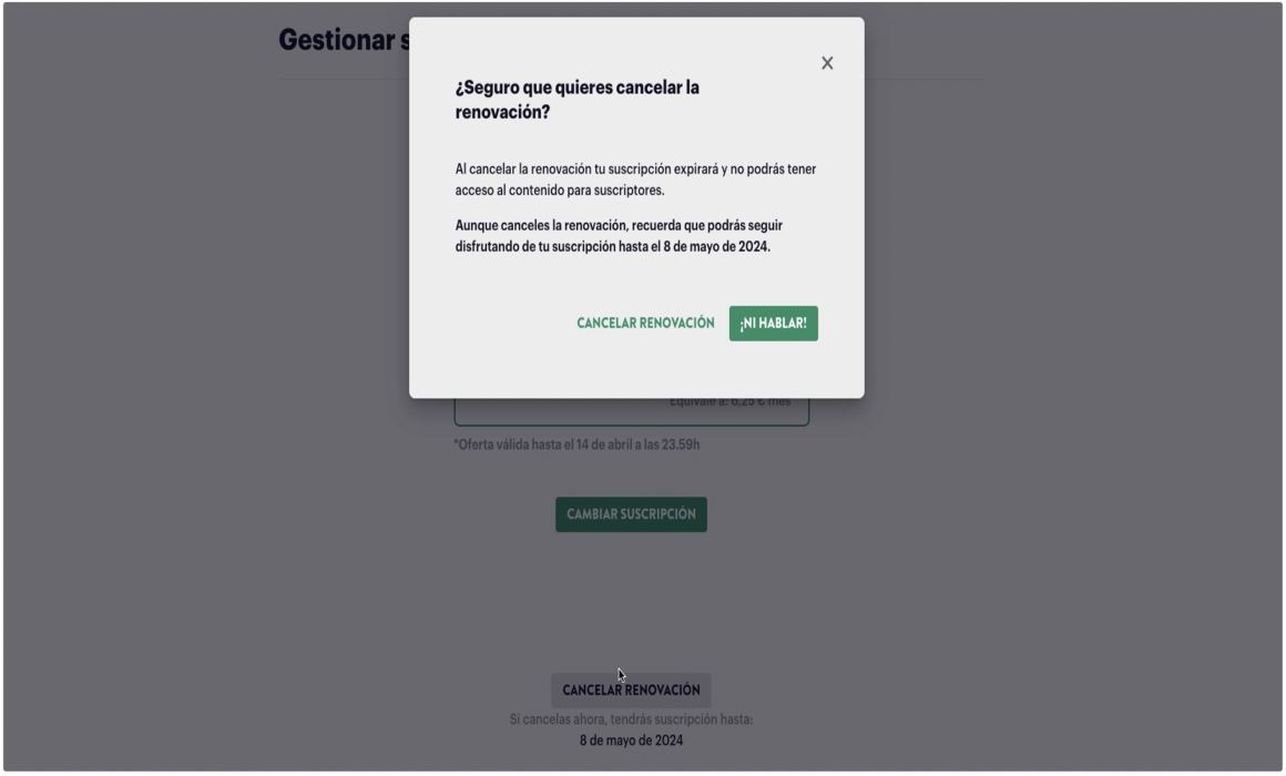
With originally nine options to choose from, there was cognitive overload in decision making. The old form was also shown after the cancellation confirmation in a modal, so many users were exiting without providing feedback, since they already completed their intended process.
Design changes
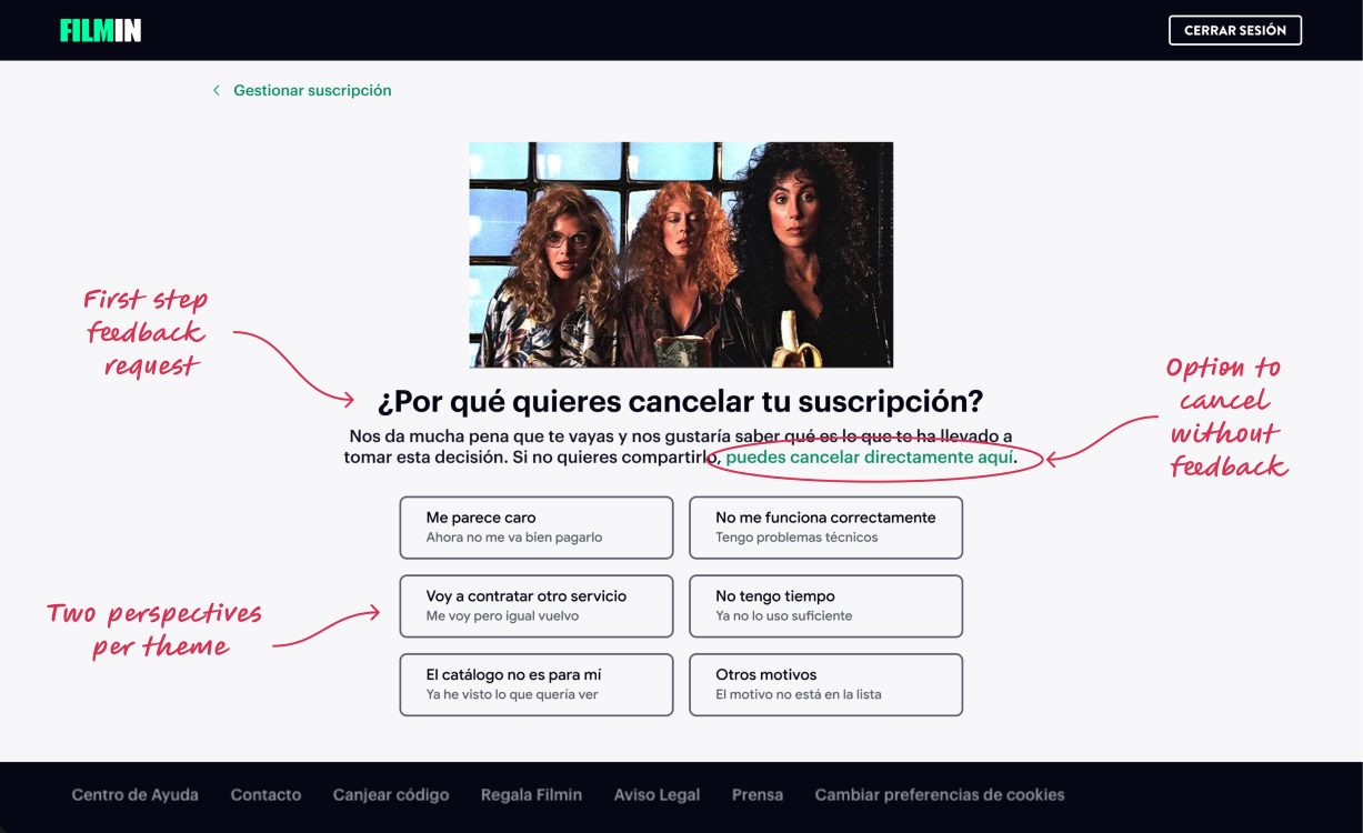
- Feedback request on first page: users are more likely to provide meaningful context during the process instead of after a completed cancellation
- Fewer options to choose from: higher probability of gathering insightful responses with lower cognitive load
- Top themes with various perspectives: one theme could have different user comments associated
- User freedom to cancel without feedback
- Design personality that better matches our branding
Trade-offs
Allowing users to directly cancel and skip feedback submission concerned some stakeholders who saw this as increasing churn instead of reducing it.
To better align our priorities, I advocated for UX transparency and emphasized the benefits of creating trust with our users, and with my team created new data tracking methods for insight gathering of incomplete feedback submission flows, as well.
Key Decision #3
Create personalized response paths
Since the original form was generic, my main goal for the new form was to lead users down the most fitting path for their situation. Considering our business capabilities with the updated form options, each feedback selection would guide the user to a relevant suggestion that could be further investigated or skipped for continued cancellation.
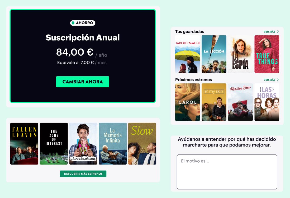
Design Changes
User feedback flows:
- Price Concerns → Alternative subscription suggestions
- No Time/Use or Replacing Service → Saved Titles and/or Titles Coming Soon
- Catalogue Disinterest → Titles Coming Soon
- Tech Issues → Help Center FAQs
- Other → Input Text Box
Trade-offs
Personalized response paths helped address specific user concerns and reduce preventable churn, but also introduced additional steps in the cancellation process.
Priotitizing user trust, every step maintained the clear option to continue cancellation at any time.
Strategy Adaptations
Direct search for technical issues
For the technical issues pathway, I challenged whether directing users to the standard FAQ list on the Help Center homepage would actually help resolve their frustration, identifying a disconnect between the proposed solution and the user’s likely goal.
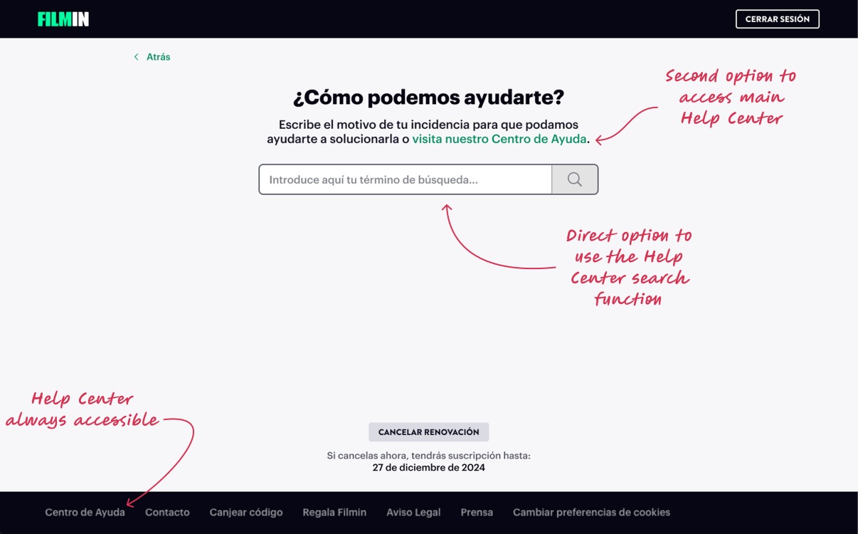
Design Iteration
Since Help Center resources were already accessible throughout the platform, I hypothesized that users reaching the cancellation flow had either not found a solution or needed something more specific.
For that reason, I proposed a direct search experience that allowed users to describe their issue and quickly access more relevant support content, creating a faster path to resolution.
Outcome & Impact
95% of users now provide a cancellation reason
Not only did the new flows increase insightful feedback gathered, they also opened an opportunity for us to better track the data associated with the journeys.
65% increase in quality feedback responses
With clearer feedback on why users are leaving, we can create new product strategy in retention efforts moving forward.
20% decrease in customer cancellation tickets
Disabling the account deletion action cleared up a lot of user confusion and helped guide them to the correct flow.
6% reduced churn after the new flows
With the new data tracking methods in these flows, we could also learn which paths were leading to users changing their minds and why.
Reflections
True needs reveal retention paths
Successful retention strategies address underlying user needs rather than trying to persuade users to stay.
Small changes, big impacts
Small changes in the order of user flows can significantly improve their impact quality, both on serving user needs and on business insights.
Freedom in decision supports retention
Retention efforts are more effective when they support users in making informed decisions rather than block their exits.
Adjacent touchpoints matter, too
Post-launch, we realized supporting emails had not been fully aligned with the journey. It highlighted the importance of considering not only the primary flow, but also the broader ecosystem of touchpoints that shape a user’s perception of the product.